Professional Logo Design Guide - From Basics to Advanced
- Published on
What is a Logo?
A logo is a symbol that represents an organization, product, or service, serving as the "face" of the brand. It is the first element that customers encounter and remember when thinking of a business. A logo is not merely a decorative image but a powerful visual tool that helps businesses convey their core values and messages to customers.
The Importance of a Logo in Creating the First Visual Connection
A logo is the first visual signal that users see when interacting with a brand. In just a few brief seconds, a professional logo design can communicate the essence, personality, and business domain of a company. For instance, Nike's Swoosh logo represents dynamism, movement, and strength – attributes that customers easily associate with sports.
A well-designed logo helps:
- Create a strong first impression.
- Embed into customers' memory, making it easier to recognize the brand among numerous choices.
- Build trust and present a professional image for the business.
The Role of a Logo in Brand Identity Strategy
A logo is at the core of every branding strategy. An effective logo not only highlights the brand's unique identity but also ensures consistency across all platforms, from product packaging and advertisements to digital channels like websites and social media.
Moreover, in modern business, a logo not only makes a brand stand out but also:
- Helps establish a competitive edge over rivals.
- Evokes positive emotions from consumers, enhancing brand loyalty.
- Supports marketing campaigns effectively, helping businesses achieve their goals.
Common Types of Logos and Effective Applications
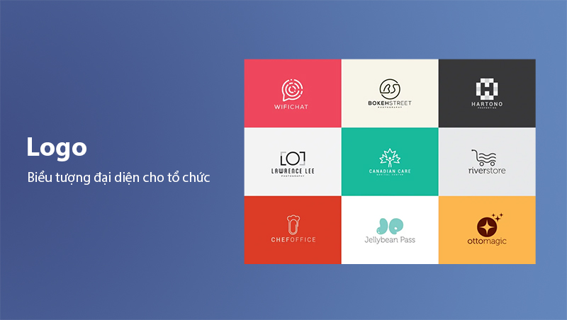
Logos come in various forms, depending on the creative approach, meaning, and purpose of the brand. Understanding the different types of logos can help businesses choose the most suitable style for their message and industry.
Symbol/Icon Logos
This type of logo uses a symbolic image to represent the brand. These symbols are often highly distinctive and easily recognizable, allowing customers to quickly associate them with the business. Examples include:
- Apple with its iconic bitten apple.
- Twitter with its bluebird icon.
Advantages:
- Compact and versatile for various platforms.
- Suitable for well-known brands or those with strong marketing strategies.
Lettermark Logos
Lettermark logos focus on using the initials of a brand, often designed as abbreviations. This option is optimal for businesses with long or difficult-to-remember names, such as:
- HP (Hewlett-Packard).
- NASA (National Aeronautics and Space Administration).
Advantages:
- Easy to read and remember.
- Ideal for small-scale designs like app icons or social media symbols.
Wordmark Logos
Unlike lettermark logos, wordmark logos use the full brand name, combined with unique fonts to create a distinctive impression. Examples include:
- Google with its eye-catching combination of colors.
- Coca-Cola with its classic, recognizable font.
Advantages:
- Effective for short, easy-to-read brand names.
- Suitable for new brands, creating a strong first impression.
Abstract Logos
This type of logo uses abstract shapes or symbols to make the brand stand out. Examples include:
- Pepsi with its dynamic globe symbol.
- Adidas with its distinctive three-stripe design.
Advantages:
- Flexible in conveying meaning.
- Creates creativity and uniqueness for the brand.
Mascot Logos
Mascot logos often incorporate illustrated characters representing the brand, creating a friendly and approachable feel. Examples include:
- KFC with the image of Colonel Sanders.
- Pringles with the cheerful old man icon.
Advantages:
- Suitable for brands aiming to build emotional connections with customers.
- Especially effective for brands targeting children or families.
Emblem Logos
Emblem logos combine images and text into a unified design, often with a classic and reliable feel. This type of logo is commonly used by traditional organizations with a long history, such as:
- Harvard University with its shield and text emblem.
- Starbucks with its circular design surrounding the mermaid figure.
Advantages:
- Evokes a sense of prestige and longevity.
- Suitable for brands emphasizing tradition or heritage.

Combination Mark Logos
This type combines images and text to create a flexible and impactful design. Visual elements can be placed alongside, interwoven with, or complement the text. Examples include:
- Burger King with its hamburger icon and brand name.
- Lacoste with its crocodile image and the text “Lacoste.”
Advantages:
- Versatile for various industries.
- Balances the uniqueness of symbols with direct textual messaging.
Dynamic/Adaptable Logos
Dynamic logos can change shape, color, or style based on the usage context. This is a modern trend, suitable for creative and innovative brands. Examples include:
- MTV with its ever-changing campaign logos.
- Google Doodles, which evolve with events or holidays.
Advantages:
- Flexible and creative, attracting attention.
- Suitable for brands targeting younger audiences.
Contoured Word Logos
This type uses text surrounded by geometric or creative outlines, creating a modern, friendly, and accessible feel. Examples include:
- Toblerone's logo with text enclosed in a triangle.
- Small businesses or cafes often use this style to convey a cozy vibe.
Advantages:
- Combines simplicity with creativity.
- Easy to apply on various materials and surfaces.
Slime Logos
This playful logo style often incorporates dynamic effects like splashes, drips, or soft transitions. It is commonly used by youthful, creative brands or products for children. Examples include:
- Nickelodeon's logo with its fun slime effect.
Advantages:
- Creates a strong impression with its uniqueness.
- Suitable for brands emphasizing fun and energy.
Keys to a Perfect Logo Design
A perfect logo design is not only visually appealing but also effectively conveys the brand's message and leaves a lasting impression. To achieve this, a logo must possess several key elements:
Simplicity
The simpler a logo, the easier it is to remember and recognize. Famous brands like Nike or Apple succeed with clean, recognizable designs that work at any size or context.
Benefits of simplicity:
- Enhances recognition at first glance.
- Adapts well across multiple platforms, from small business cards to large billboards.
Clarity
An effective logo must clearly convey the brand's message without confusion. Visuals, colors, and fonts must harmonize to ensure customers immediately associate it with the business sector.
Timelessness
Logos should be designed to last over time without becoming outdated. A prime example is Coca-Cola, whose logo has remained largely unchanged for over 100 years, symbolizing durability.
Adaptability
A good logo should be flexible and look clear across all platforms and materials, from phone screens and websites to product packaging. In the digital age, logos must adapt well to different devices.
Consistency
The logo should align with other elements in the brand's identity, from color schemes to typography. This consistency reinforces the brand image in the customer's mind.
Embedded Messaging
An effective logo is not just aesthetically pleasing but also encapsulates the brand's meaning and values. For example, the rings in the Olympics logo symbolize the unity of continents.
The Professional Logo Design Process
Logo design is not an impromptu task but a strategic process planned carefully. Each step ensures the final logo is not only visually appealing but also optimally effective for the brand.
Setting Objectives
Before starting, define the logo's goals and requirements clearly:
- Who is the target audience?
- What core message should the logo convey?
- How can the logo reflect the brand's values?
A successful logo must be built on specific goals and clear planning from the outset.
Market and User Research
- User Research: Understand the preferences, behaviors, and psychology of the target audience. This ensures the logo resonates effectively.
- Market Research: Analyze competitors and industry design trends to create differentiation.
Brainstorming Creative Ideas
Based on research findings, designers sketch out logo ideas, including:
- Choosing a style (simple, modern, classic, abstract...).
- Defining colors, fonts, and layouts.
- Proposing different logo versions for testing.
Refining Details
Once the direction is chosen, the designer polishes the logo to perfection:
- Ensuring balance in composition.
- Adjusting colors and lines for the best effect.
Testing the Logo
Test the logo in real-world scenarios:
- Display it on various platforms like websites, apps, and print materials.
- Evaluate its recognition and customer perception.
Creating a Logo Usage Guide
After finalizing, a usage guide ensures the logo is applied consistently in marketing and communication materials.
Tips for Designing a Business Logo
Designing a logo is not just about art; it’s a vital part of business strategy. To ensure the logo is both attractive and effective, businesses should consider the following:
Building Differentiation
Your logo must stand out in a competitive market. This not only makes the brand easier to recognize but also creates a strong impression on customers. Avoid overly common design elements or copying ideas from competitors.
Target Audience Alignment
Understanding your audience helps design an appropriate logo. For example:
- For young customers, a modern and dynamic design is preferable.
- For middle-aged customers, prioritize simplicity and elegance.
Smart Color Choices
Colors not only beautify the logo but also influence customer emotions and decisions. Some suggestions:
- Red: Encourages energy and enthusiasm.
- Green: Represents freshness and eco-friendliness.
- Blue: Creates a sense of trust and professionalism.
Consistency
The logo must align with the overall brand identity, from style to colors. This consistency builds a cohesive image that’s easily recognizable across platforms.
Focus on Practical Application
Logos must be versatile for various contexts, such as:
- Printed on product packaging.
- Used on digital platforms.
- Integrated into marketing materials or offline events.
Conclusion: The Value of a Perfect Logo
A professional logo is not just a brand's symbol but a strategic tool that builds trust, enhances competitiveness, and drives growth. From research to creation to testing, investing in logo design yields long-term value, helping your brand deeply connect with customers.
Remember, a logo is not just an image – it’s the story and vision of your brand. Therefore, choosing a professional logo design process ensures you convey the right message, leave a lasting impression, and achieve your business objectives.
Comments
0 Comment(s)
Loading...
Latest Posts

Lesson 26. How to Use break, continue, and return in Java | Learn Java Basics
A guide on how to use break, continue, and return statements in Java to control loops and program execution flow effectively.

Lesson 25. The do-while Loop in Java | Learn Basic Java
A detailed guide on the do-while loop in Java, including syntax, usage, examples, and comparison with the while loop.

Lesson 24. How to Convert Decimal to Binary in Java | Learn Basic Java
A guide on how to convert numbers from the decimal system to the binary system in Java using different methods, with illustrative examples.

Lesson 23. How to Use the While Loop in Java | Learn Java Basics
Learn how to use the while loop in Java with syntax, real-world examples, and practical applications in Java programming.
Related Posts
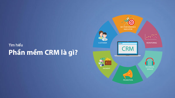
What is CRM Software? Top 15+ Best Customer Relationship Management Software
Discover the definition of CRM software, its role in customer relationship management, and a list of 15+ top CRM solutions to help businesses enhance customer service performance and achieve sustainable growth.

What Is Local Guide? Benefits of Becoming a Local Guide on Google Maps
Local Guide is a community program by Google Maps where users can contribute reviews, photos, and location information to improve map data. This article explains what Local Guide is and the benefits of being an active member.
What is Zalo OA? A Detailed Guide to Creating Zalo Official Account for Businesses
Zalo Official Account (Zalo OA) is a crucial tool that helps businesses connect with customers and optimize their online business operations. This article provides a step-by-step guide on how to create a Zalo OA from A to Z.
What is Zalo Ads? A Guide to Running Effective Zalo Ads
Discover what Zalo Ads are and learn how to run effective Zalo advertising campaigns to reach customers and boost sales in the digital era.

